
This post aims to analyze design principles applied to an Ad Campaign for Audible, an audio book provider. In conjunction with the original ad, I will also attempt to describe an ad that I pieced together as inspired by the ad campaign.
Original Ad by Audible

Audible is the leading and largest audio book producer and seller. It was bought by Amazon and has since produced audio entertainment from its own studio. In this ad campaign, Alvin Groen depicts how Audible’s broad library and top-of-the-line audio performances can make someone escape to any story they listen to.
Design

Effective application of repetition is evident in this ad through the consistent use of the orange from the company’s logo. It was used in the ad’s subject and the text which really ties the entire ad together.
Color

In this ad, we see the orange accent to highlight the company logo and the different shades of blue in the foreground and the background. The effective use of these complementary colors makes for a more pleasing and overall put-together appeal.
Typography
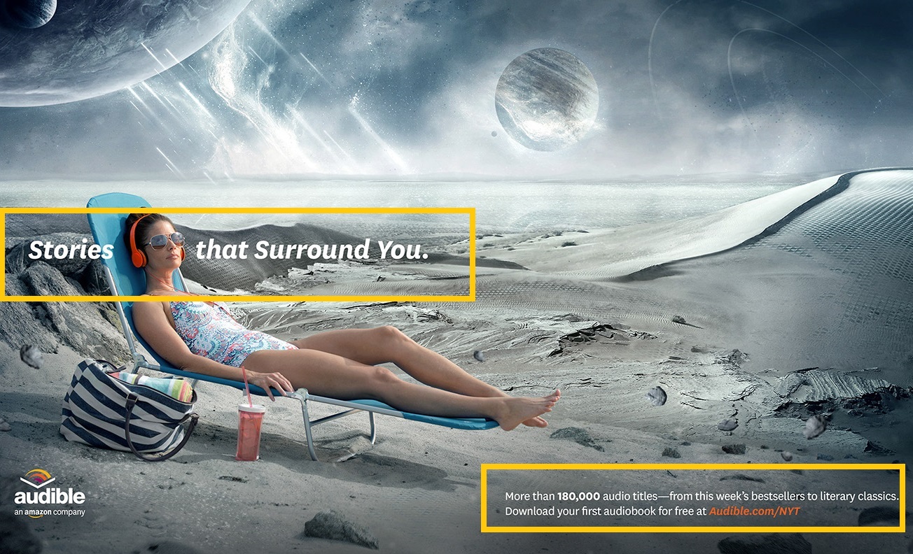
Two sans serif fonts were used in this ad to make the text easier to read and give a relaxed feel. We see different font weights to differentiate based on importance. The application of this design principle guides the viewer’s eyes through the most important information to the least important.
My Ad

Design

To mirror the original ad, I made deliberate use of orange and used it in different parts of the ad to strengthen its uniformity. This repetition can indicate that the two ads come from the same campaign.
Color
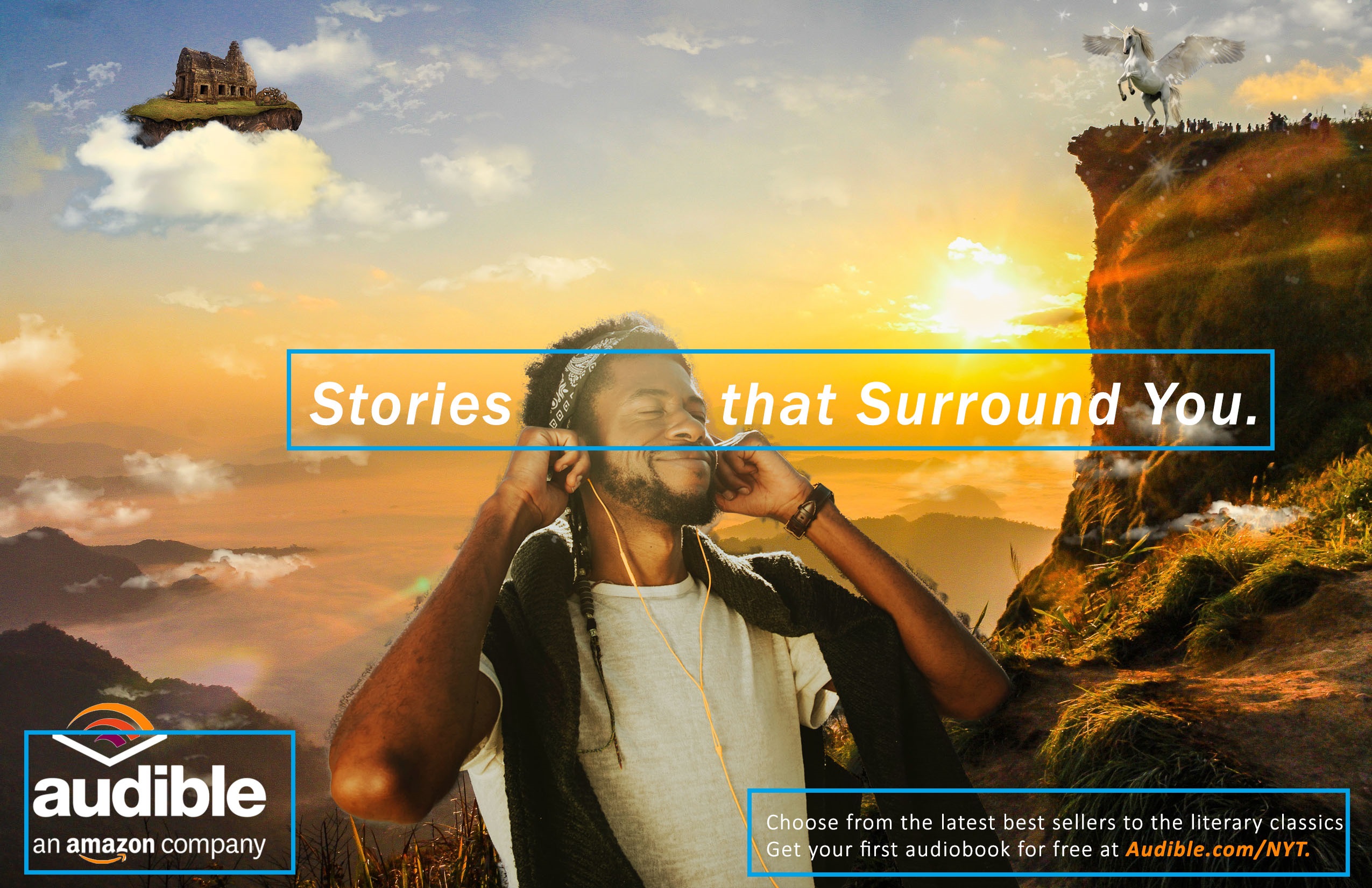
Since the background is made up of quite an array of colors, I chose to just keep the text white for contrast. This makes the text pop out and becomes very visible to the eyes.
Typography
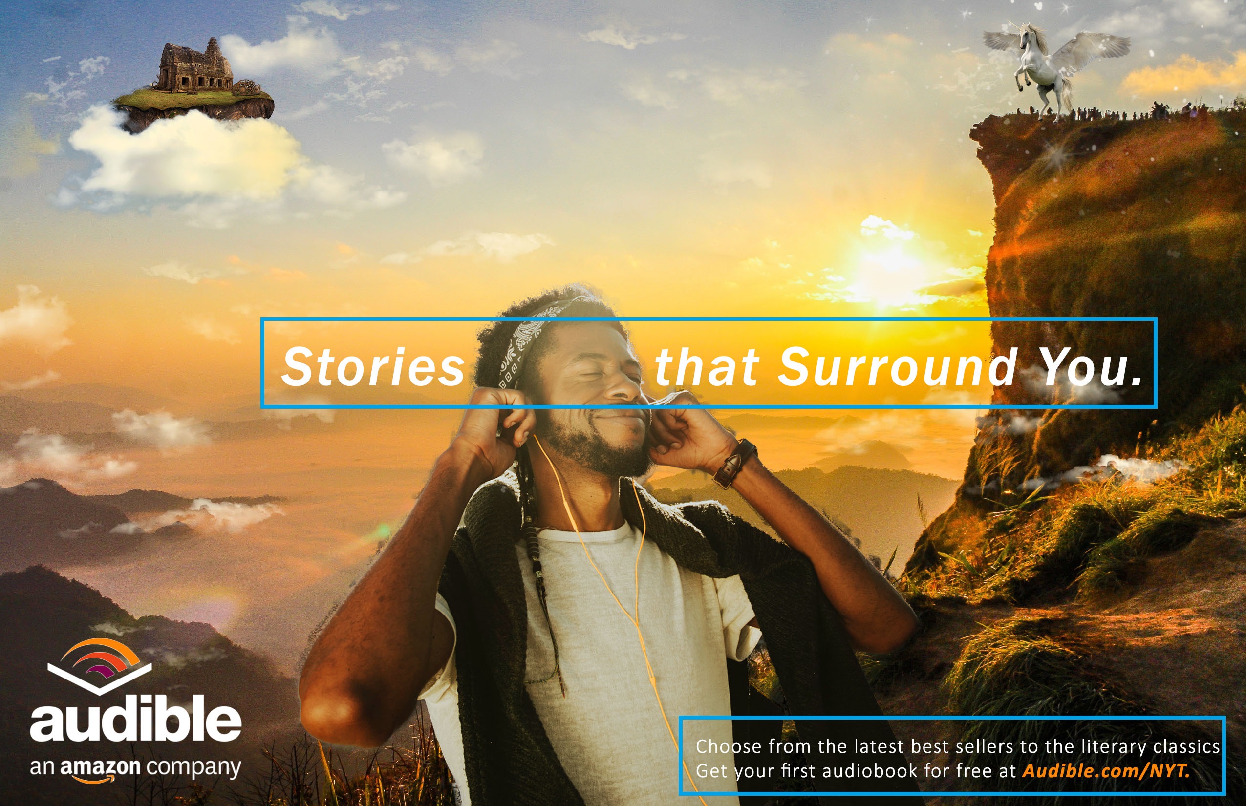
Since I wanted to make my ad exude a very relaxed mood, I chose sans serif fonts. I made the tagline bold and italic in a bigger font size to draw people’s eyes to it first. The supporting text contains a bold, italic web address in color to highlight its importance.
Final thoughts
Due to the use of obvious thematic elements, such as the use of the same color accent, logo and tagline placement, as well as the creative concept of melding fantasy settings with everyday scenarios, these two ads could work well for the same campaign.

 Olea's Blog